My Flat plan:
Wednesday, 26 January 2011
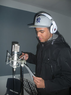
i have descided to explore and experiment with photography. i have used both original concepts and my own new creations. these photoshoots will help me to have a more efficient and better quality front cover shoot. i have been experimenting with styles and location to create a more deeper impacting image.the image is deepend through the use of gaze theory and the three quarter composition of the photo. the gaze theory used in my image is very suggestive and inviting to the user as it isnt to full on eventhough there is a direct eye line to the reader. Mise en scene is very important in my images if i am to produce an image of accuracy in relation to the hip hop genre, this is created through the use of Dr Dre Beats headphones and the use of a NY yankees fitted cap which are both very common in the genre and therefore links the model back to the industry stars such as New Yorker JayZ. some of my photographs are below:
Wednesday, 19 January 2011
Practise cover!
i have decided to make a practise cover, this will enable me to determine the eventual layout of my final magazine cover. it also enable me to create a link to my research and incorporate ideas from my brainstorms. i beleive that making this practise cover enable me to be more efficient in my idea concepts and also increase the time frame when creating my final cover.
i have incorporated my research in to the cover, an example of this is the source inspired front cover layout witht the puffs above the title and also the bold lined title linked by colour to the main picture.
Tuesday, 18 January 2011
Tuesday, 11 January 2011
Hip Hop Media Mag
through my mood board above i have tried to represent the general perception and iconography of hip hop however have also shown some images of apsiration that i found commonly depicted through songs discovered in my research. i have shown strong images to relate back to not only the overall dominering nature of the genres artist but also the background of the music as it has developed from an urban environment. the block nature of the traditional styles for representation of the genre stem from the urban background as the blocky charcateristics relate back to the rigid nature of the streets and buildings the genre was conceived in. the artist depicted above are very influential to the genre therefore they have a very serious persona this is the reason for many of the images being displayed in black and white, the black and white could also relate back to the un neggotating veiws preached by the artist in the rap community. "Bling" is very common thrughout the hip hop/ rap genre, bling is commonly used to show and rate the success of an individual artist. bling can be intergrated in to many different iconographies not just jewlery but also cars and clothing.
Subscribe to:
Comments (Atom)


