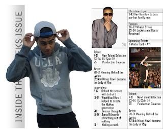
In my first edit of my contents page i have tryed to use subtle tones which wont over power the photos or be to imposing to the eye of the reader. I have focused the contents page arund a main image taken from the inspiration of the vibe contents i analysed earlier. The contents page is a double page spread, this allows me to map all my pages and articles out clearly and still have spae for images. due to my page not being so condensed it makes it easier for the reader to read and navigate. In my secind edit i hope to add in a bit more colour to the page as i think it is a bit to bland in its current state. I am also going to create a bridge between the text and the main image

No comments:
Post a Comment